The visual language for Klaire Packs: logo, colour, type, patterns, photography, and the print files for every pack. Everything here can be downloaded and used in Canva, sent to a printer or shared with press.
Printers and press: download any pack's files below, or use the direct links.
Each section has its own link too, e.g. klairepacks.org/Design-System#print-welcome.
Clear, warm, never clinical. Written as if handed over by a person who cares.
Speak gently and directly to someone having a hard day.
Practical and honest. Say what is in the pack and why.
Lean toward the next step, without forced cheer.
A circle and centre dot with "Klaire Packs" in Spectral. Use the supplied files; never redraw the logo.
1.5 × the wordmark's cap height (14pt → 21pt), 1:1.
One inner circle away from the K, centred on the K.
Circle top sits two circles above the wordmark baseline.
"Made with care." at 50% size, one cap height below.
Warm and earthy. Each pack owns a colour family. Always use the exact hex in print.
Pack backgrounds: Welcome uses its light shade; Steady and Onward use their mid shade. It's inconsistent on purpose, because it looks better.
Spectral for the wordmark, headlines and numerals. Public Sans for everything else. Both are free on Google Fonts and in Canva.
Soft line icons: 24px grid, 1.7 stroke, round ends. Use them sparingly in print and social. Each one comes as an SVG in ink, terracotta, sage and paper.
The journey ripple: a solid centre for the person and three rings for the three packs. Always one centre and three rings, on a pack colour or paper, never on black.
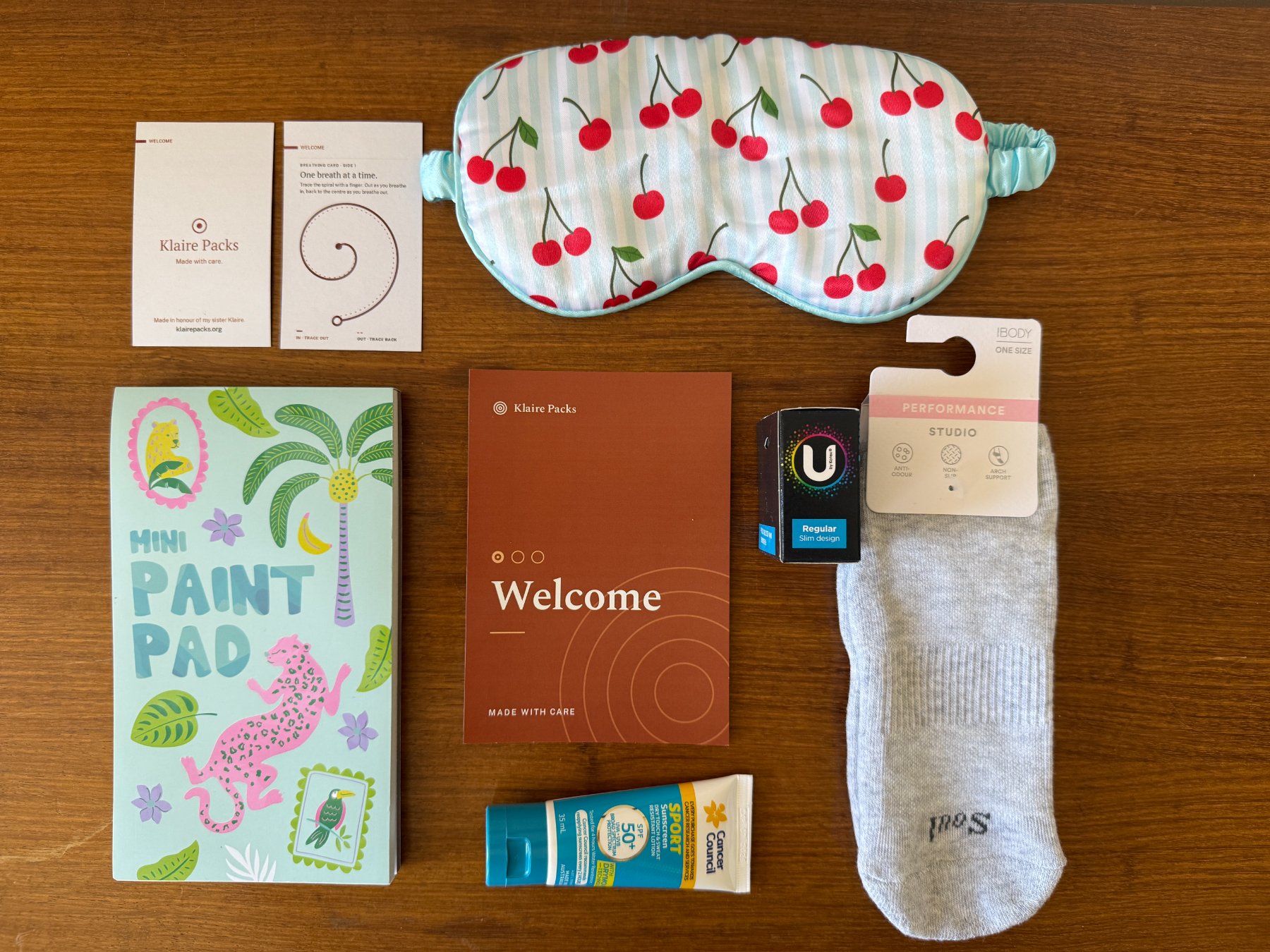
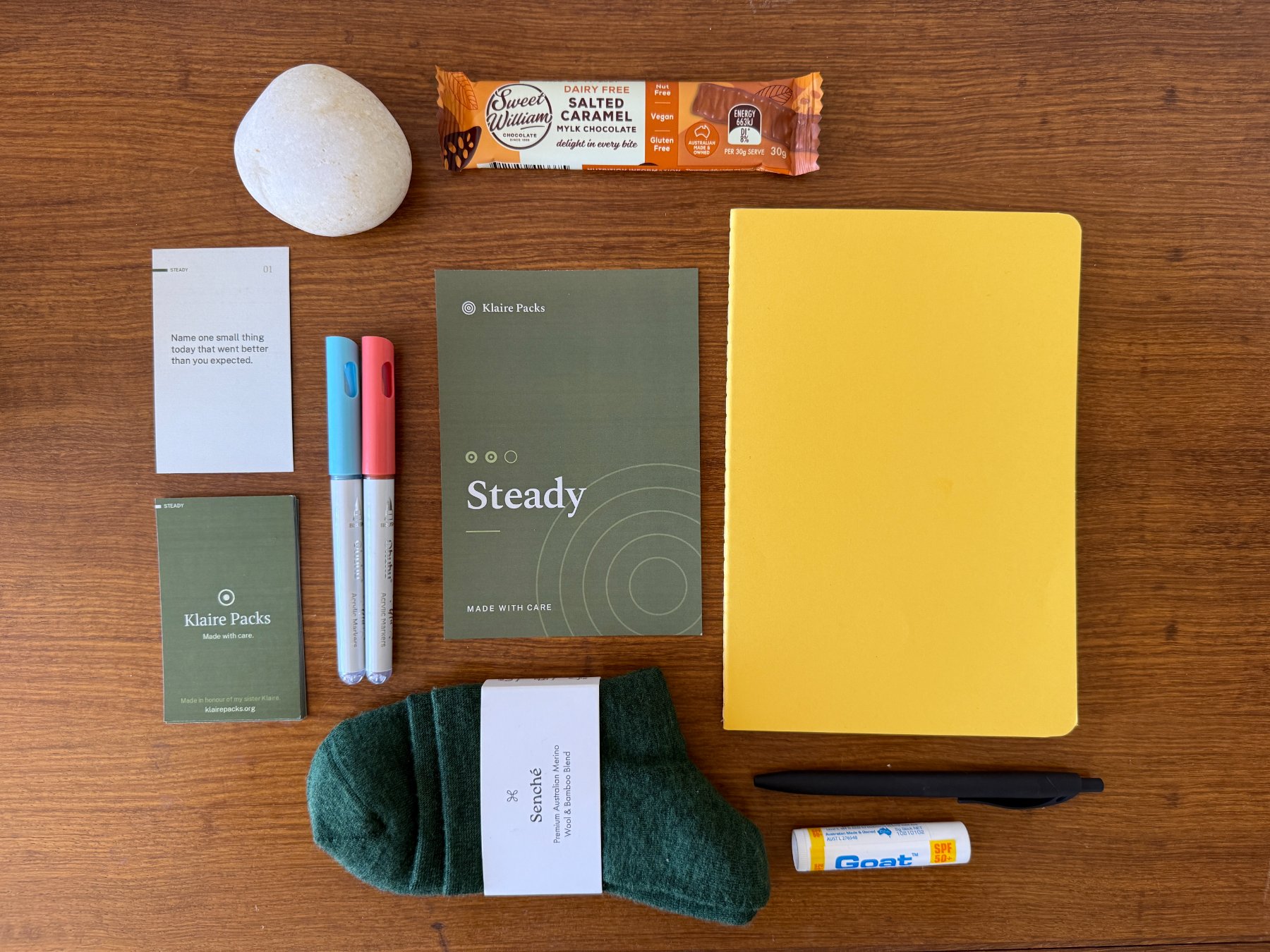
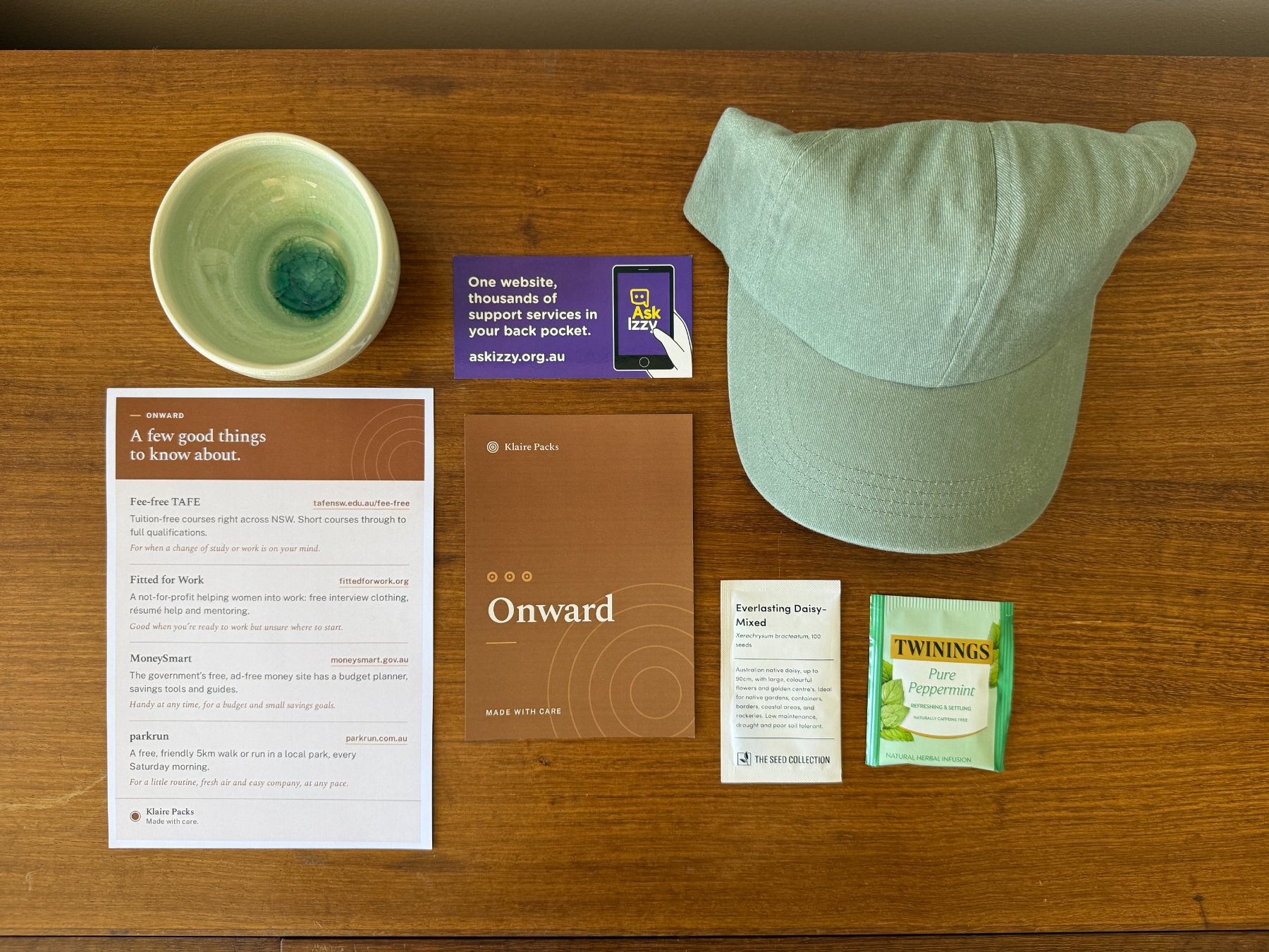
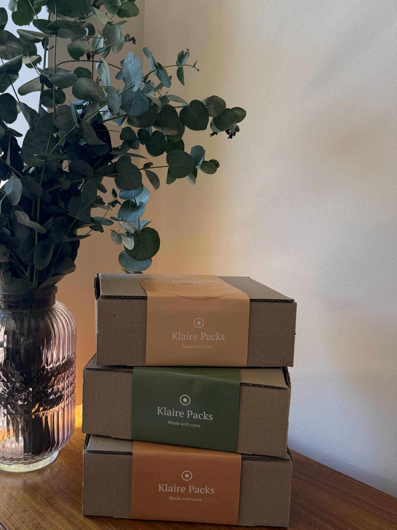
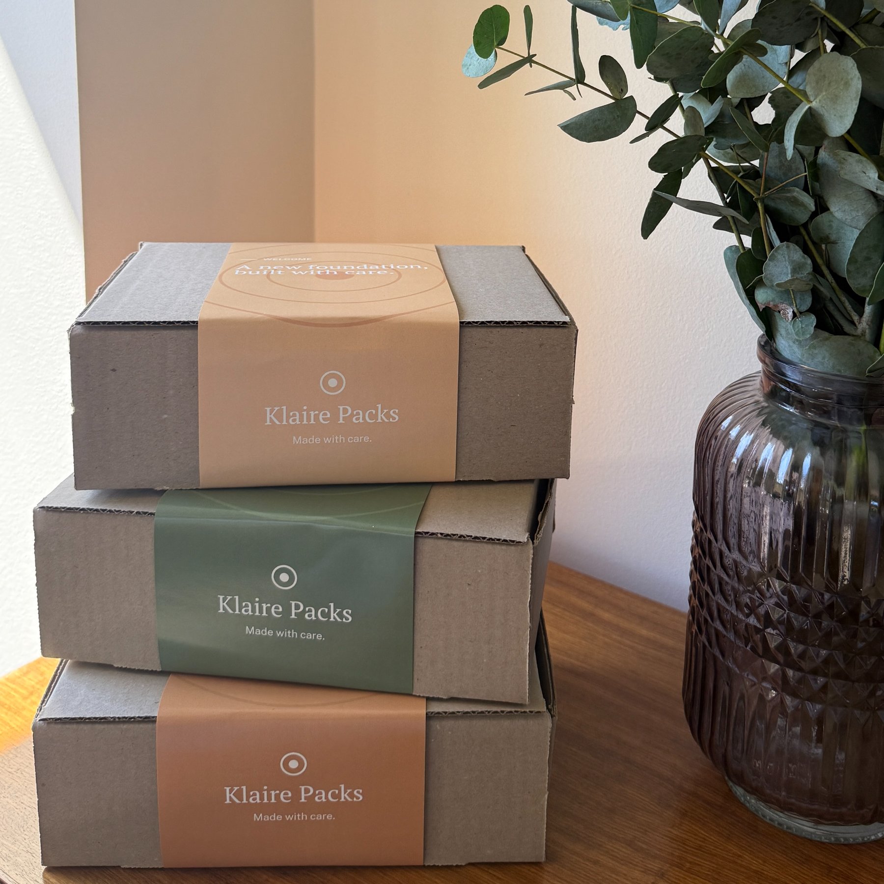
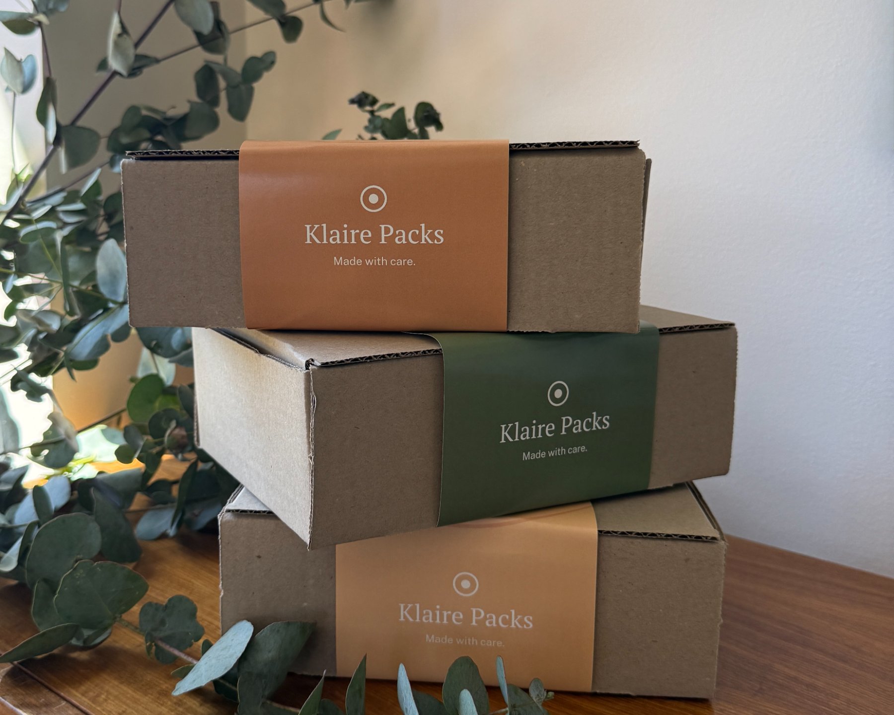
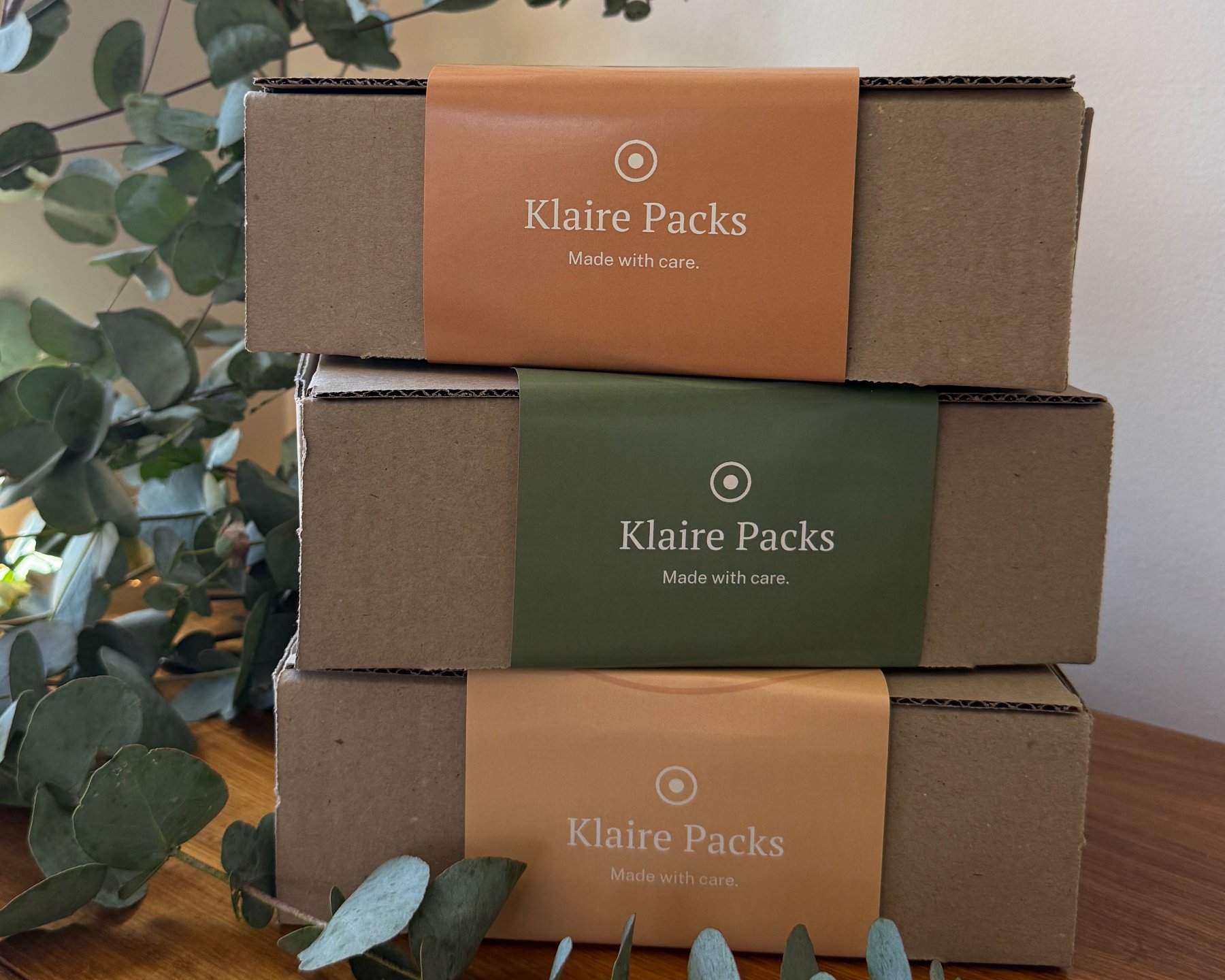
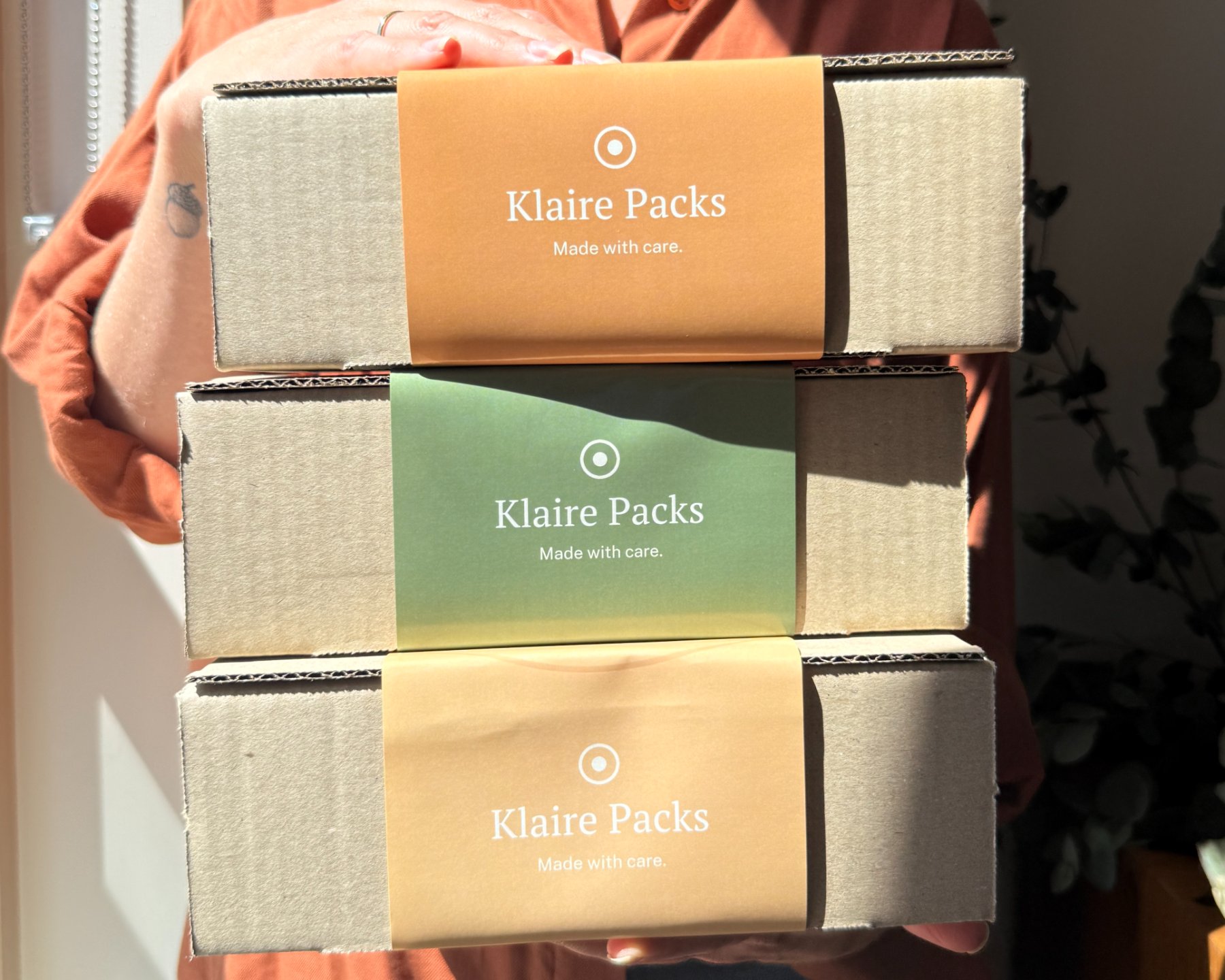
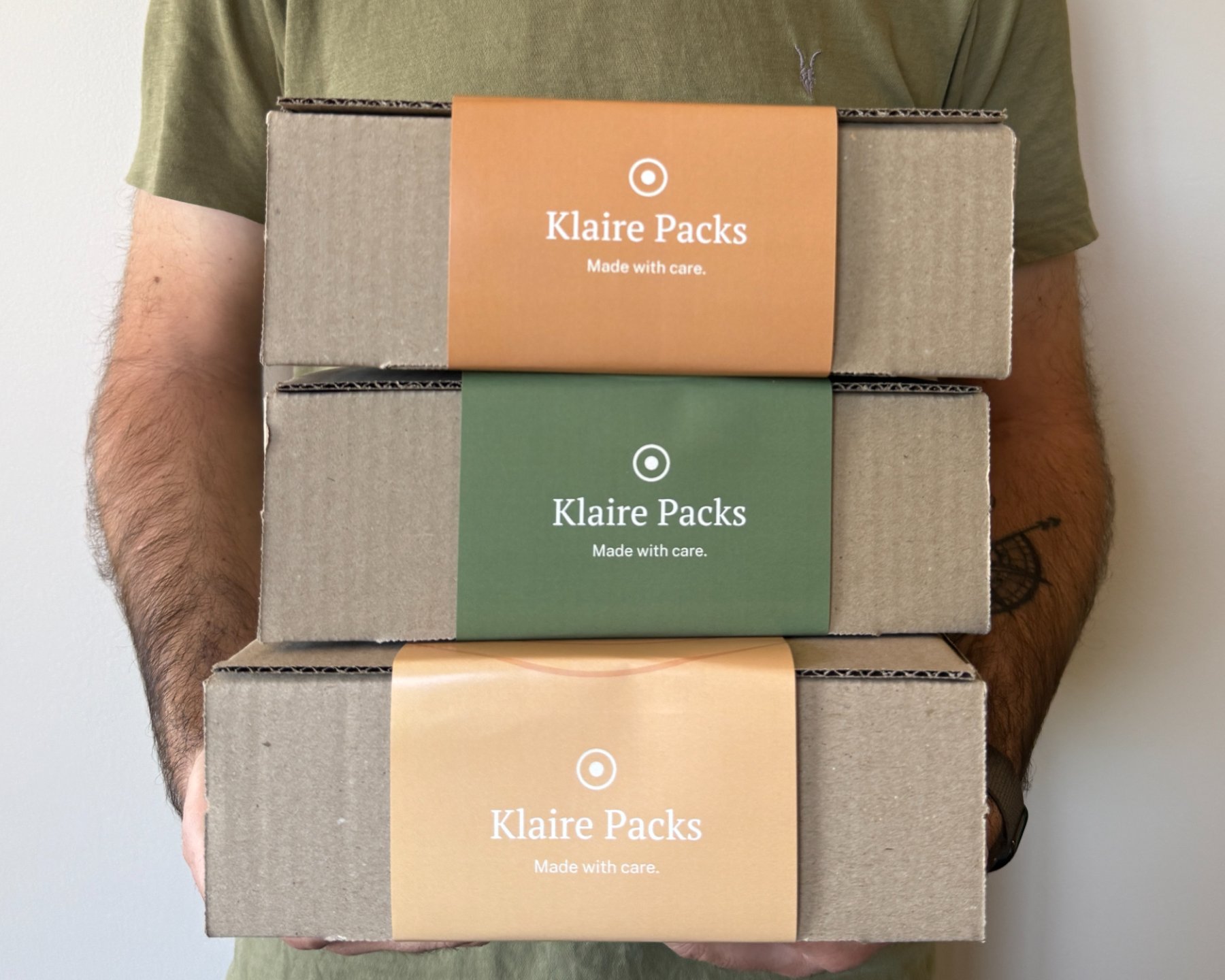
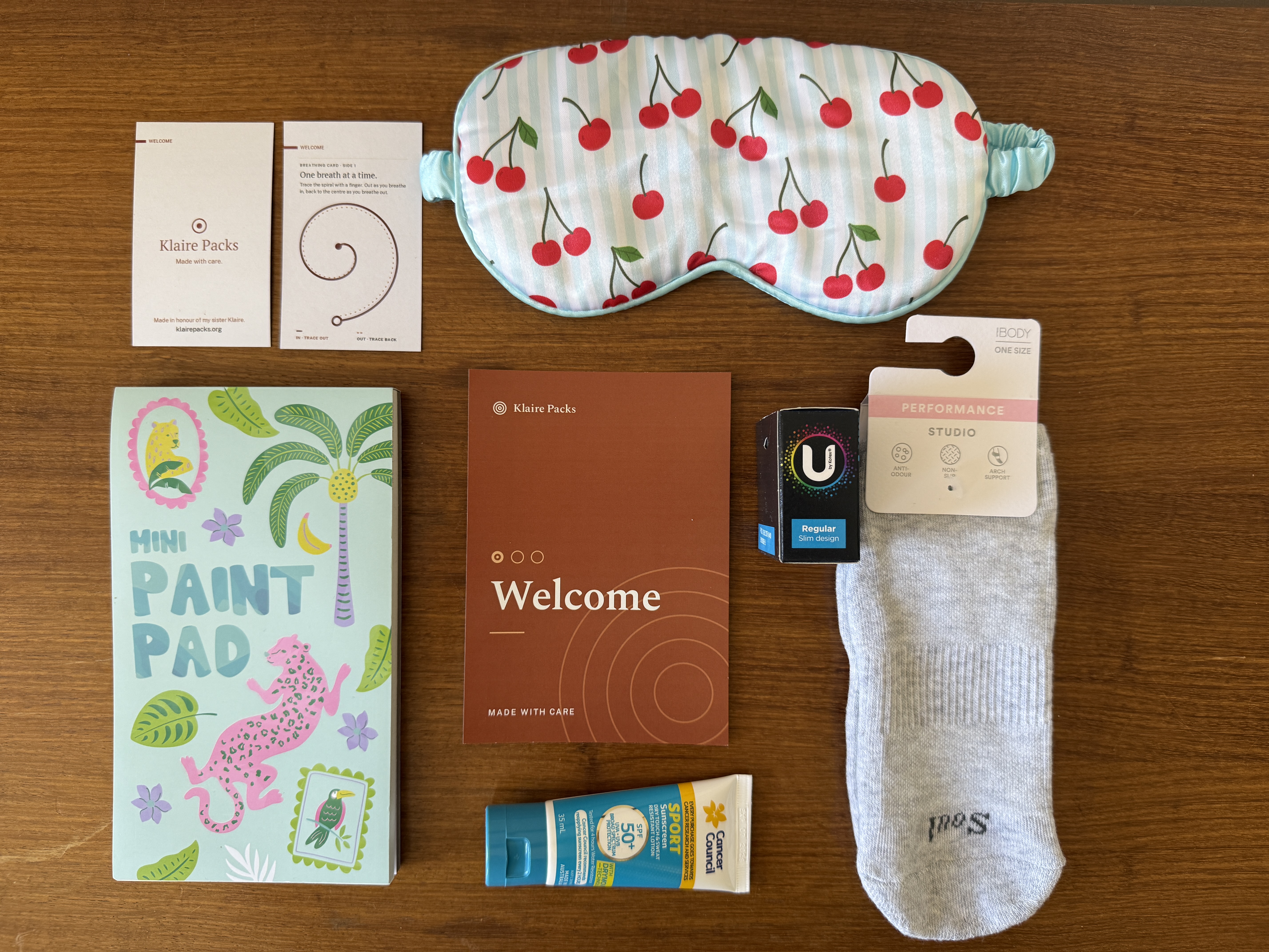
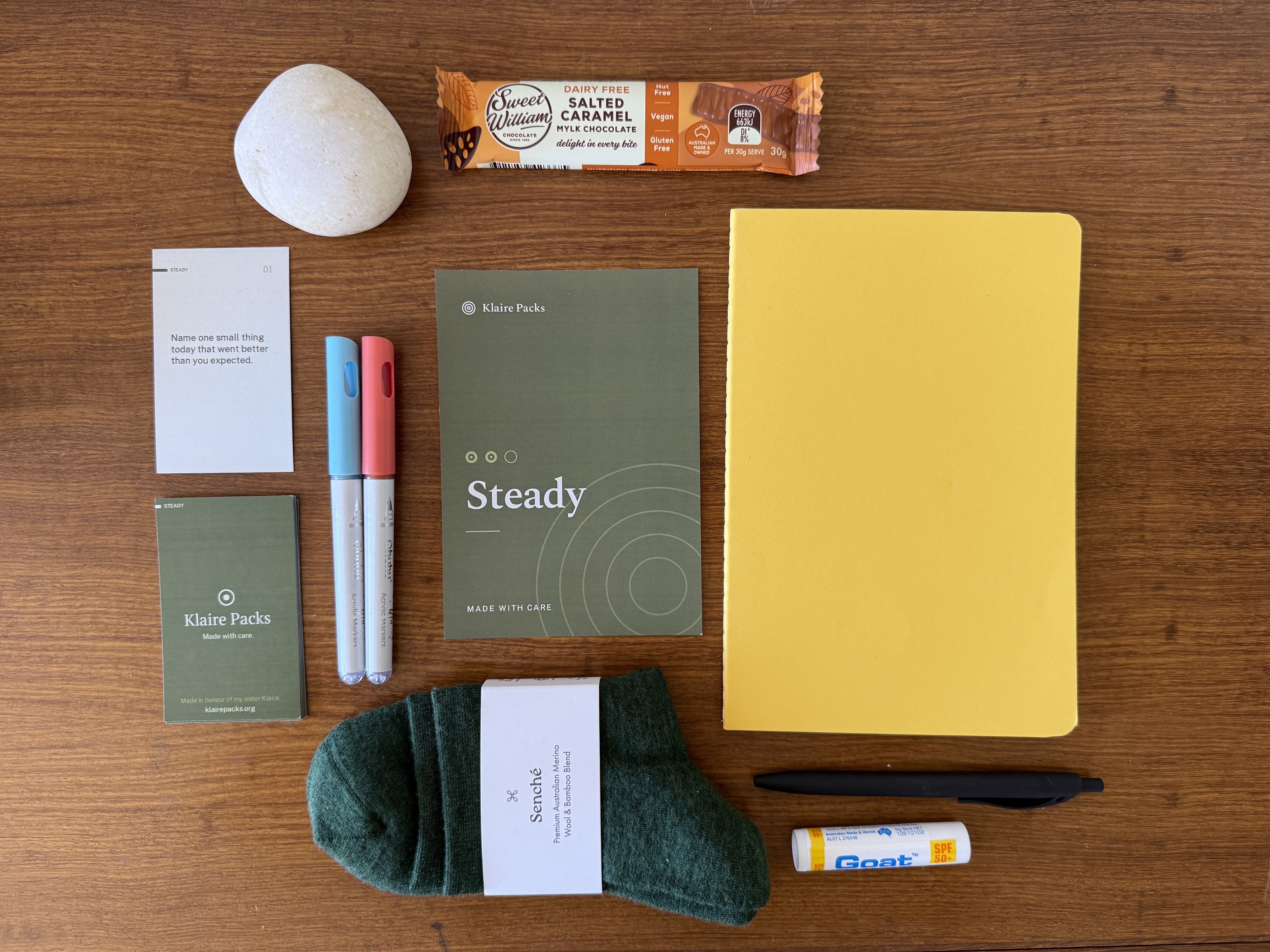
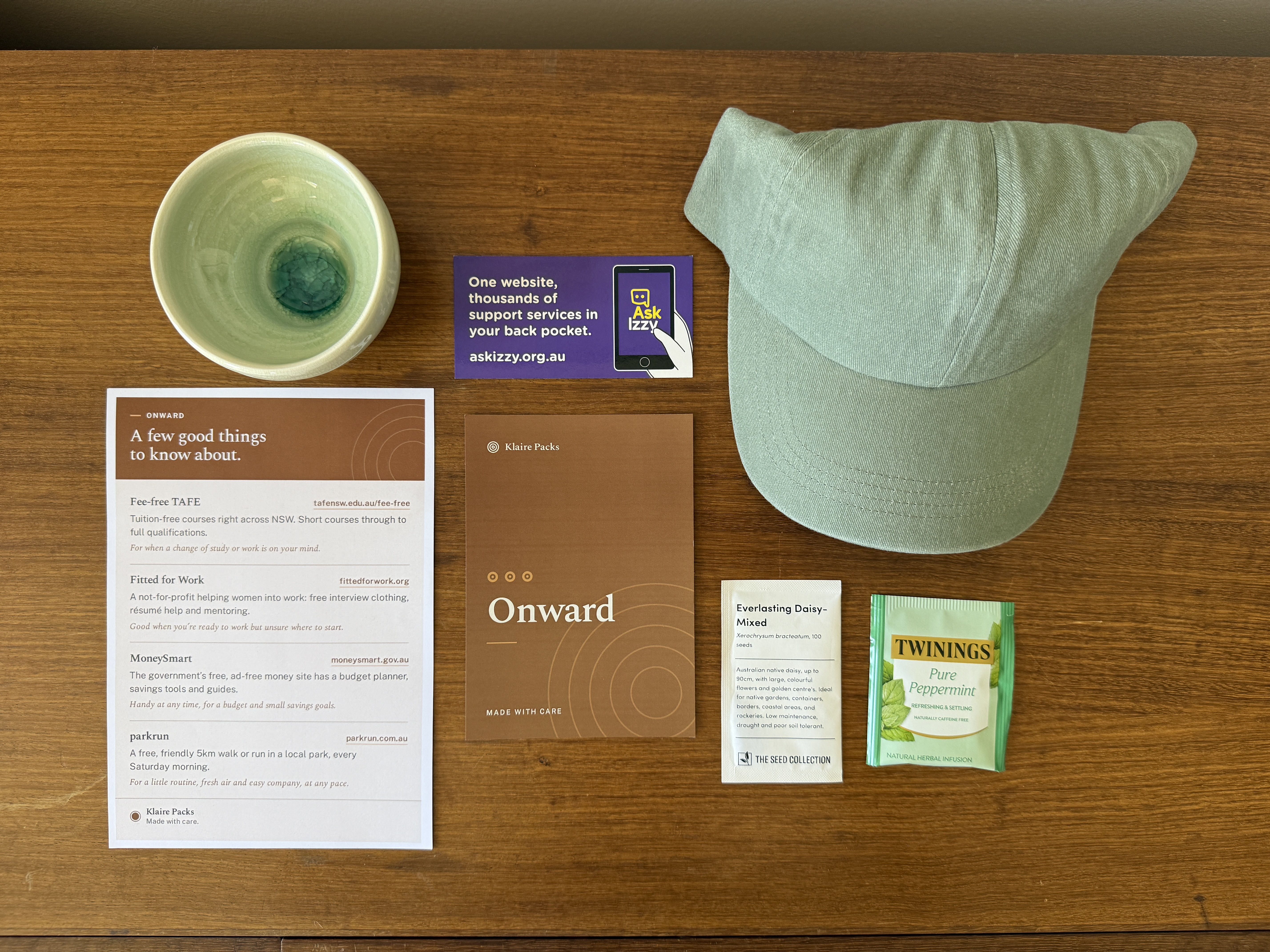
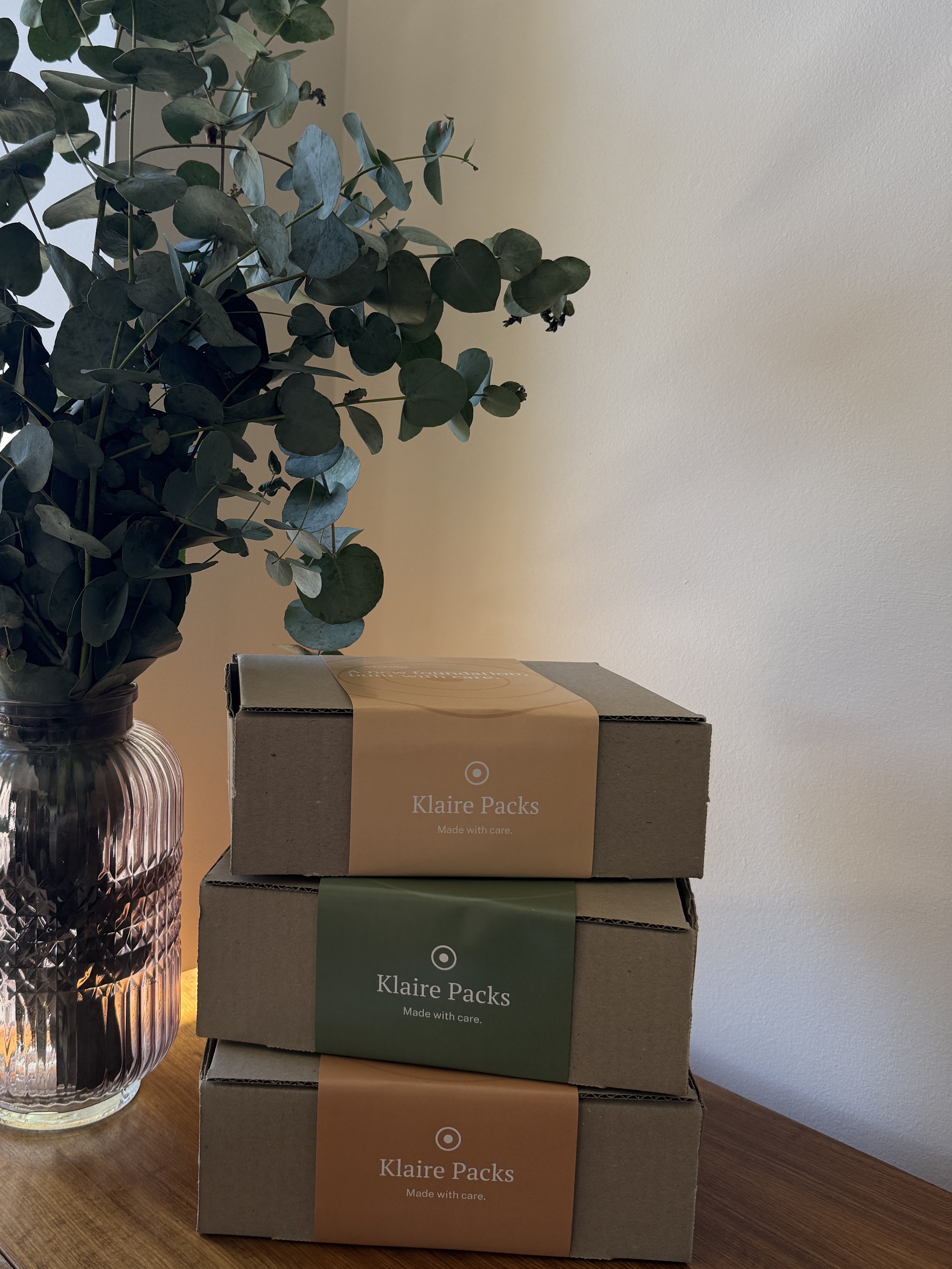
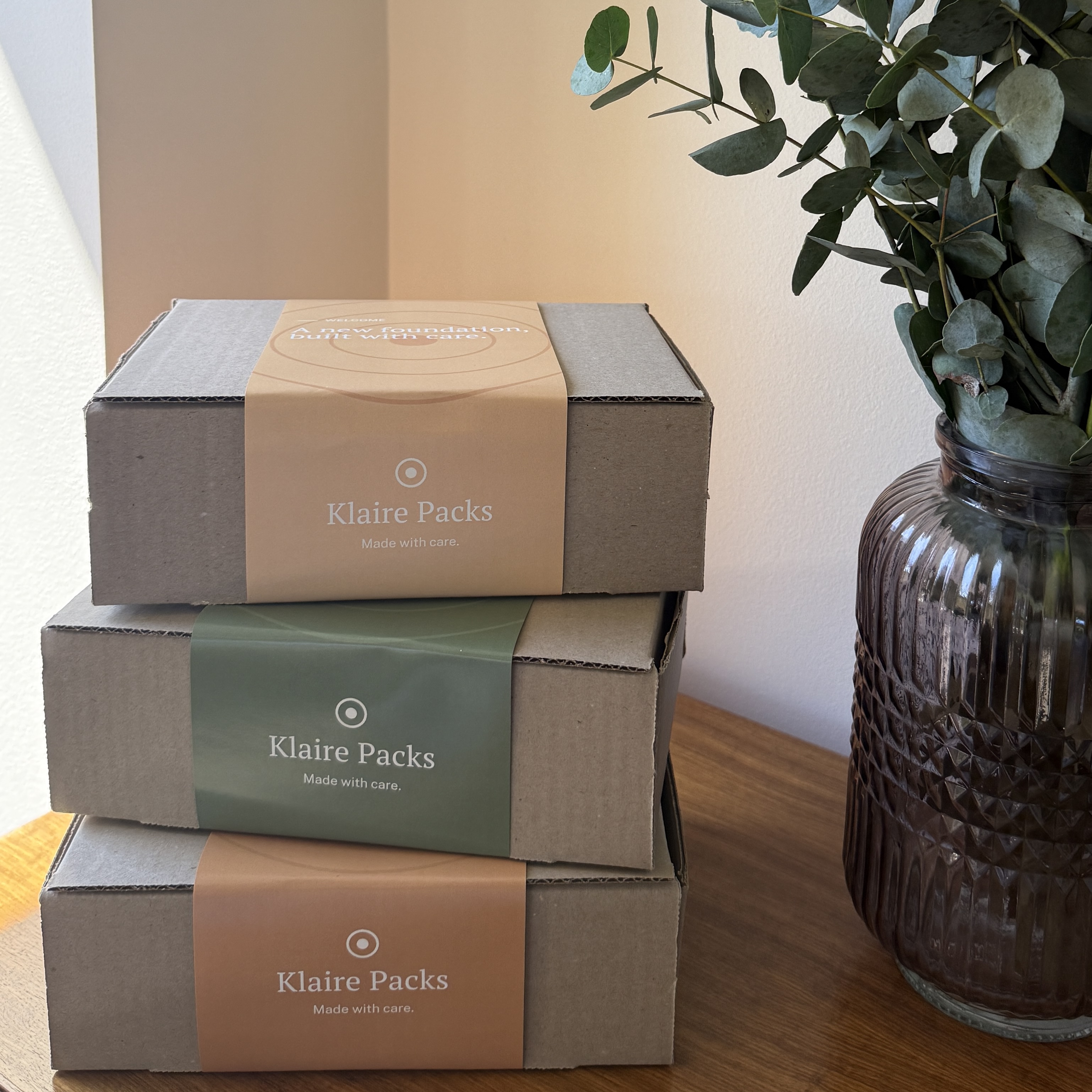
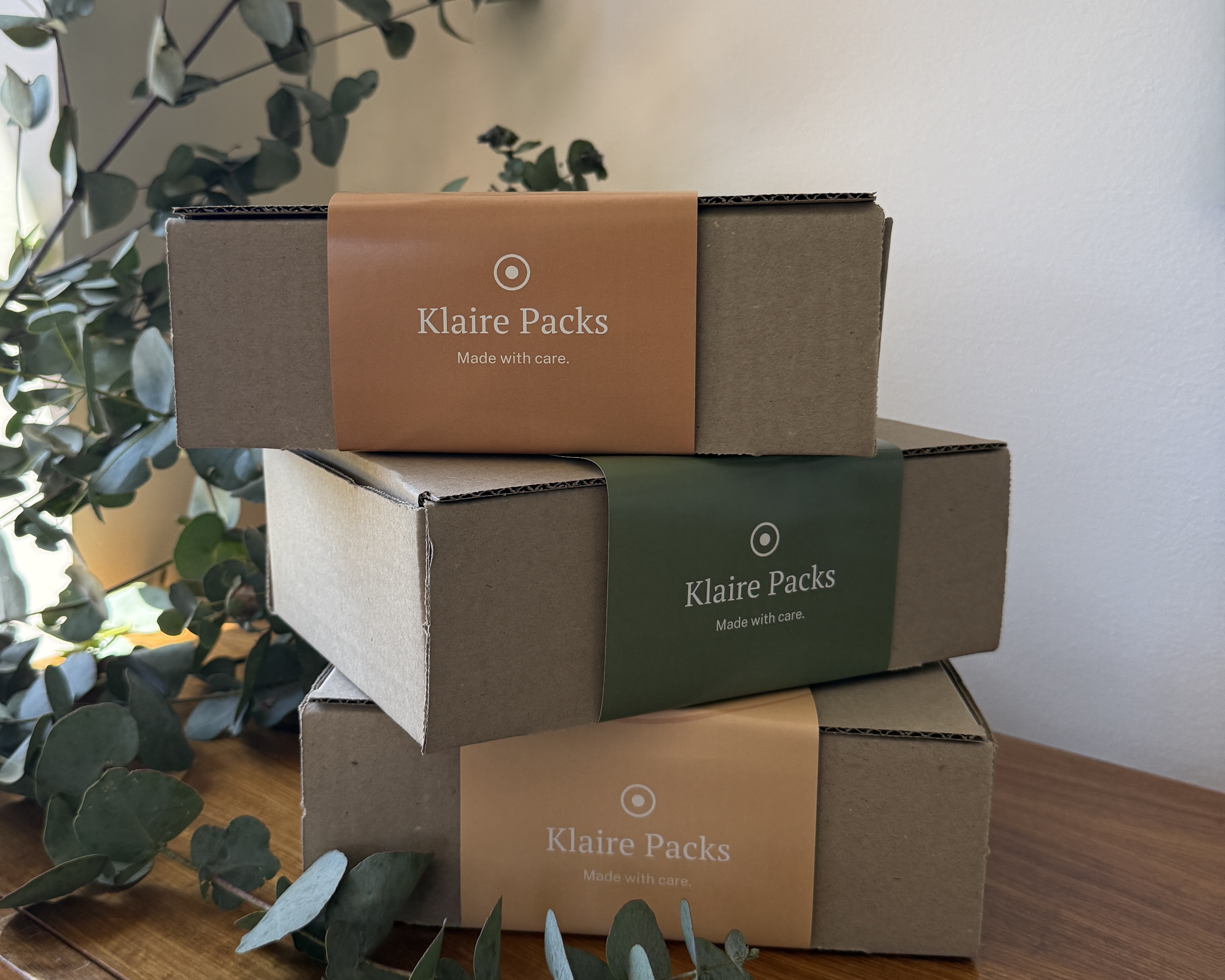
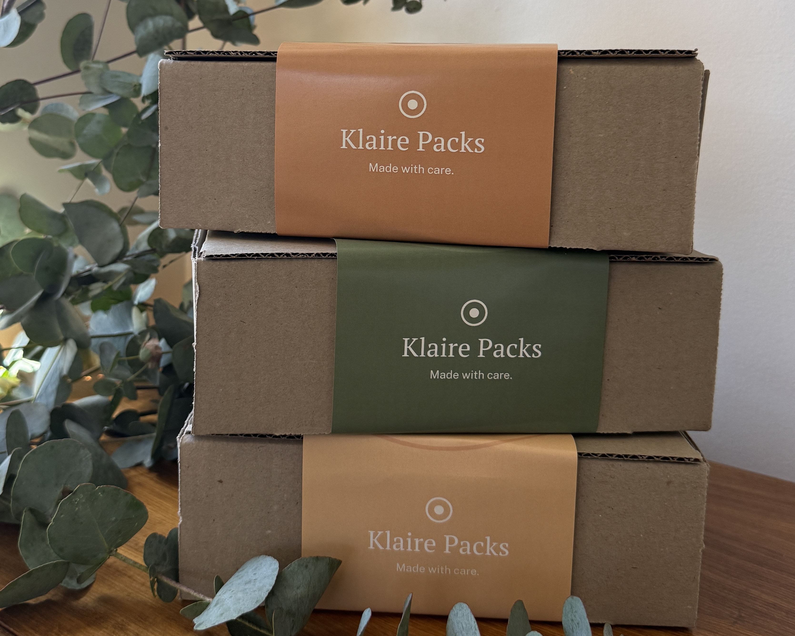
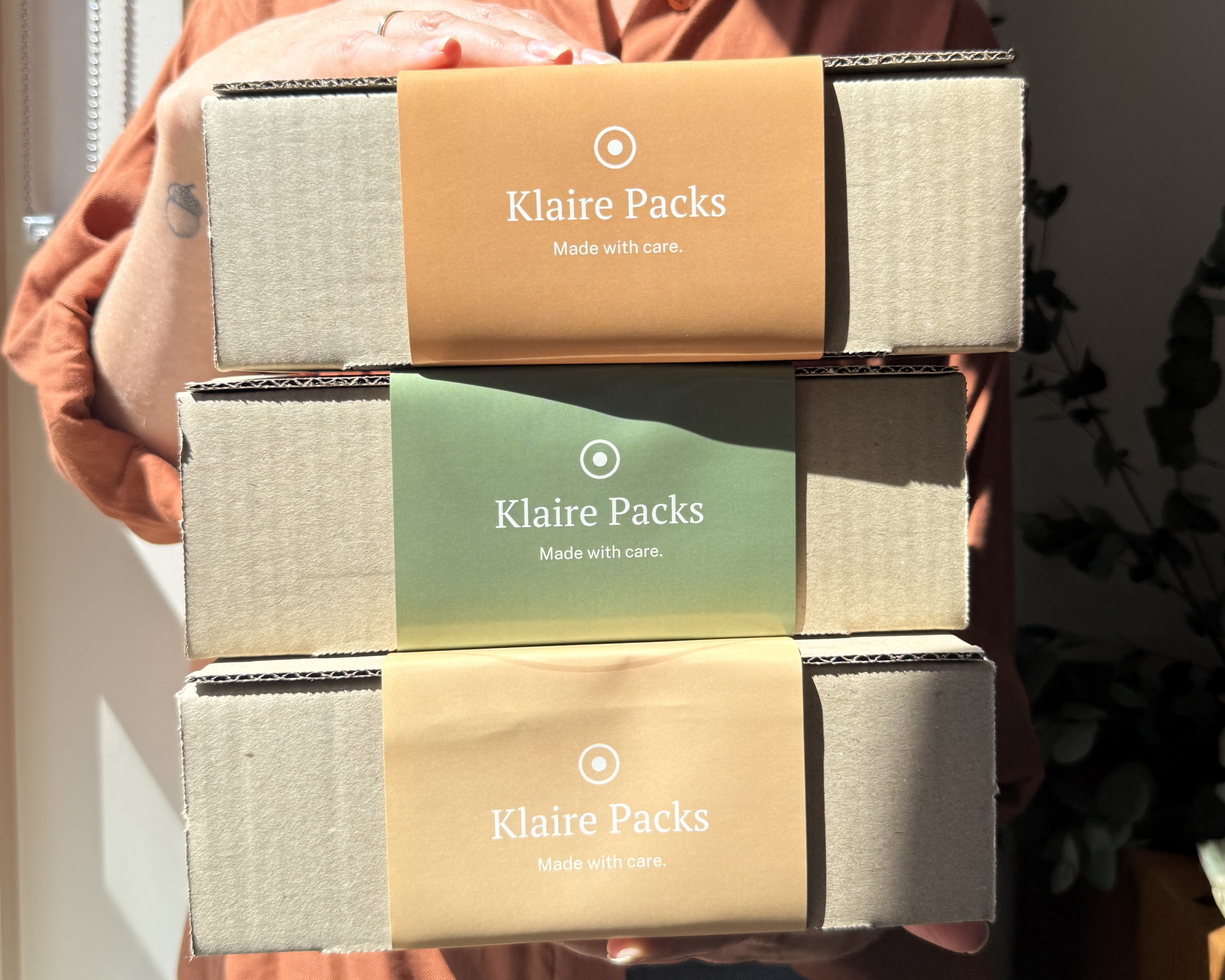
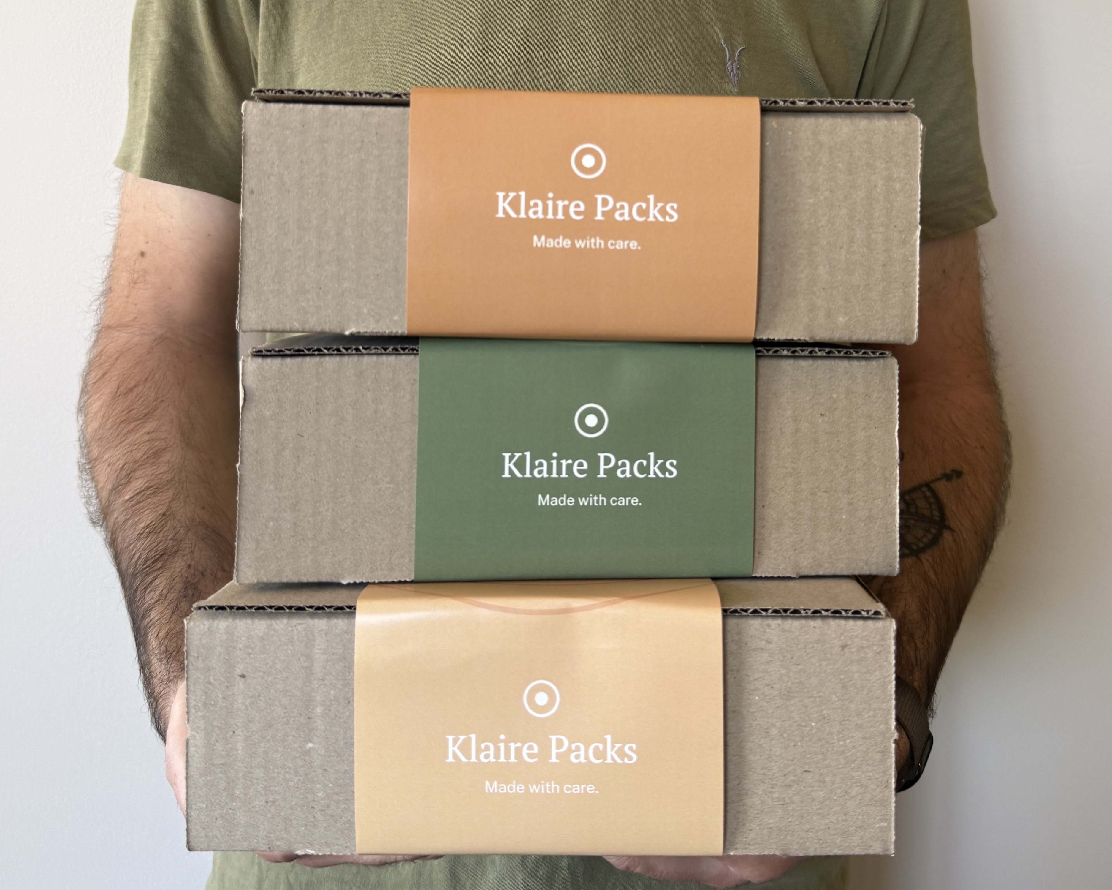
Real packs only, on warm timber in natural light. Flat lays from above, or box stacks with eucalyptus or held by a person. People appear as hands, arms or torsos, never faces.
The print files for each pack, as print-ready PDFs. Download a whole pack in one go, or send the link to this page to a printer.
For press, PR and partners. Questions about use? Email luke@klairepacks.org.